- Joined
- Jan 8, 2019
- Messages
- 56,605
- Solutions
- 2
- Reputation
- 32
- Reaction score
- 100,451
- Points
- 2,313
- Credits
- 32,570
6 Years of Service
76%

When thinking about UI Design, we often imagine beautiful detail pages or visually stunning dashboards.
What really matters for companies hiring UI designers?
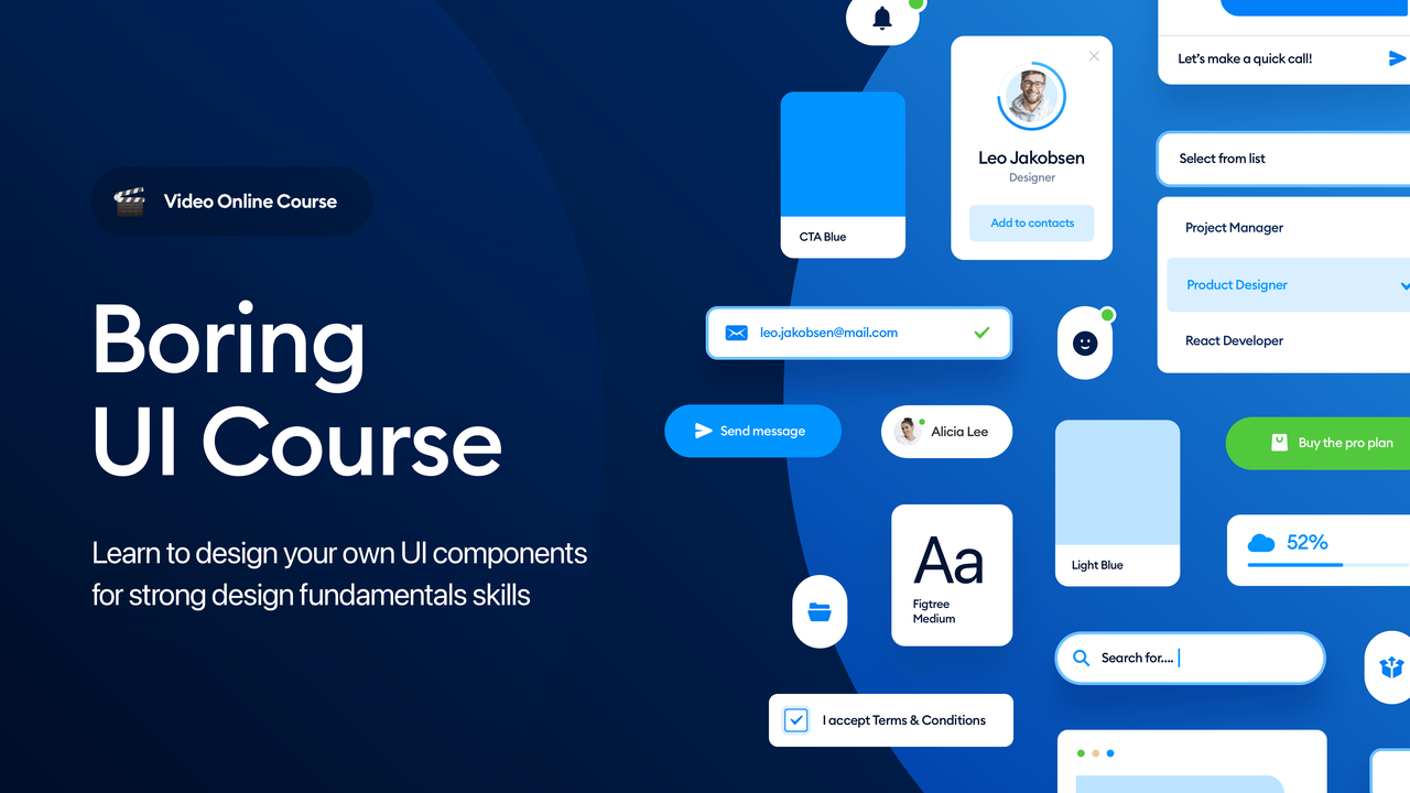
In reality, the most common things UI designers do are pretty "boring". It's a set of components like inputs, buttons, cards, and list views arranged and re-arranged into many different configurations.
I've noticed many juniors lack these fundamentals and when the time comes to design something real they're lost and confused.
They may know how to design a button or a dropdown, but their components like consistency and proper hierarchy.
With this course, you'll learn the fundamentals of creating a beautiful, consistent, and thought-out component set - a skill that companies REALLY want from UI designers.
Just making a set of buttons is easy. This course takes you much, much further!
You will learn:
Understand the WHY!
It's not about recreating some UI elements, but rather UNDERSTANDING the WHY - why they have these sizes, proportions, how they work together, and a lot more!
And it's only a small group - the full course covers a lot more and how to use them together for the best User Experience.
Code:
https://hype4.academy/video-courses/boring-ui-course
To see this hidden content, you must like this content.